Friday, 16 December 2011

A study of Sherlock Holmes


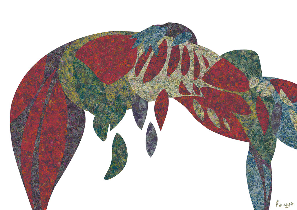
A study of one Sherlock Holmes and the Hound of the Baskervilles.

These two elements are part of the same illustration, inspired by the classic Sherlock Holmes crime novel
the Hound of the Baskervilles.

Again, as in the Adventure of the Speckled Band, in
the Hound of the Baskervilles
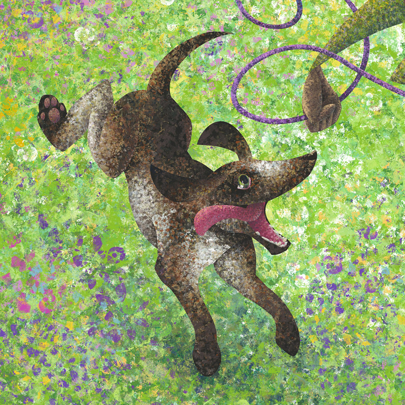
the breed of the canine is not clarified, but instead we are only told that it's a big hound. After some research I decided that the Great Dane (aka Danish Hound) was a perfect candidate for the role as it's great in size and can look menacing, so I sketched my Baskerville Hound using the Great Dane as reference.

Thursday, 15 December 2011

Sherlock Holmes: The Adventure of the Speckled Band


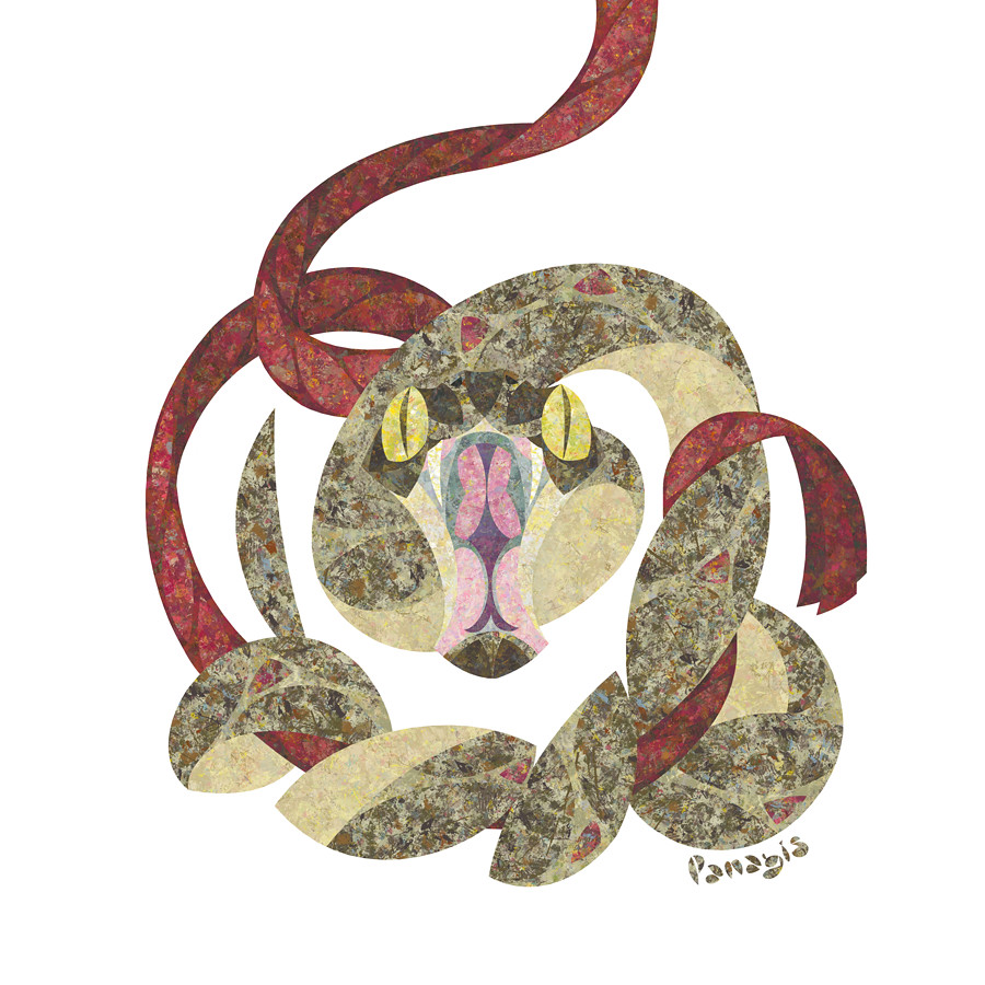
The Adventure of the Speckled Band is a Sherlock Holmes adventure written by Sir Arthur Conan Doyle. In this detective story the murderer uses an Indian swamp adder that crawls down a bedside bell rope to kill his victims, without leaving any traces behind. One of the victim's last words are "It was the band, the speckled band!" referring to the snake.

It is one of the most imaginative
Sherlock Holmes short stories, regarding the murder weapon. The Indian swamp adder has a lot of people puzzled as to what manner of a snake it was, as there is no such species.

I wanted to illustrate my impression of the venomous Speckled Band, as it crawls down the rope and attacks. It was a lot of fun trying to create a snake's face from the front, as there is little there to work with. Using geometry to solve the problem, I came to this interesting hourglass shape for its face and gave the swamp adder huge yellow eyes to create the image of death in its expression.

It's a little homage to Sir Arthur Conan Doyle's Sherlock Holmes I wanted to pay, as I often work while listening to his adventures, dramatised for radio with Clive Merrison and Michael Williams.

Friday, 2 December 2011

Lion


A new project can be very exciting to begin. Starting on a collection of illustrations of wild animals I felt the need to push my artistic vision to a different direction. I began with the king of the jungle, the lion, and used geometry, circles and ellipses, to bring together a my composition and give it balance. When it came to colour, I wanted to become even more adventurous and added to the palette more colours, other than the expected yellows and browns.
With this illustration, as well as the ones to follow, my goal is to present wild animals through a more colourful lens using a lot of imagination to capture their spirit and their character.

Thursday, 1 December 2011

World AIDS Day


World AIDS Day is held on 1 December each year and is an opportunity for people worldwide to unite in the fight against HIV, show their support for people living with HIV and to commemorate people who have died. 
 
taken from the website www.worldaidsday.org

Tuesday, 29 November 2011

Lion - preview


With all those holiday cards I missed my animals. I have started making a new set of illustrations that focus on animals in the jungle.
So once more I resort to geometry to find beautiful shape compositions and a balance in my design.
Although there is geometry and symmetry, to a degree, I always keep my shapes organic and uneven.
Starting to work on these illustrations I'd like to experiment a bit more with colour combinations and use bigger texture patterns in order to give a richer, more unique look.

I began working on the lion and have been taking my time discovering the geometry in his face and mane as well as the colours that express his might and power.

Wednesday, 23 November 2011

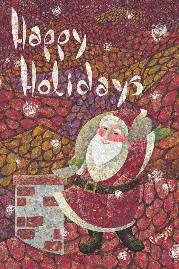
Merry Christmas

--> Now on Sale here <--


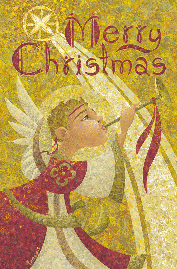
This is the final holiday greeting card I designed to celebrate the upcoming holidays. The star over Bethlehem and an angel spreading the news of the birth of the baby Jesus.

For this Christmas card I used gold and red colours to follow a more traditional aesthetic and reference the more spiritual aspect of the holiday as well.

Wednesday, 16 November 2011

Spring - revisited

 
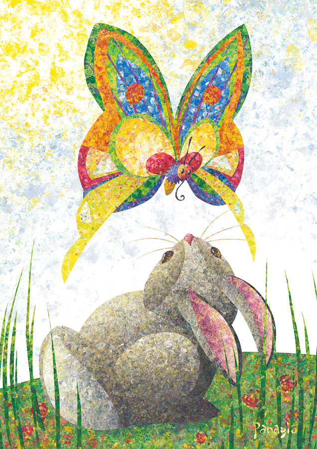
I decided to print some posters for my nieces for the upcoming holidays and thought my illustration "spring" would make for a beautiful poster as it's colourful and has a butterfly and a bunny, doesn't get better than that! However, when I printed this illustration in the past I found that I would have liked the colours to be a bit different, so I went back to the original illustration and spent a few hours making all of the changes I wanted  before I have it printed in poster size. Now it is finally ready and looking better than ever!

Monday, 14 November 2011

Happy Hanukkah!


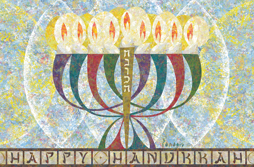
The Festival of Lights, the eight days of Hanukkah!
The menorah has eight candles that symbolise the eight days the Maccabees’ menorah miraculously remained lit for, despite the fact that the oil fueling it was only enough to last for one day, during the Jewish revolt against the Seleucid monarchy. The ninth candle in the middle is the shamash, the servant, used to light the other eight candles.

You can buy my Hanukkah Cards by clicking here!

Friday, 11 November 2011

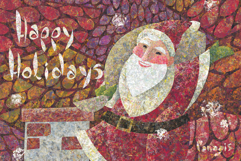
Christmas Cards!


Winter brings us festivities and celebrations once more, it’s the time of the year when we exchange wishes and give presents to our beloved ones.

For this Christmas I have designed a card in red to capture the warmth the holidays bring to our hearts despite the cold weather.

You can buy my Christmas Cards by clicking here!

Sunday, 30 October 2011

Happy Halloween!


Trick or treat, smell my feet.
Give me something good to eat.
If you don't, I won't be sad.
I'll just make you wish you had!


Friday, 28 October 2011

Space Fantasy Project

Here are some more sketches of creatures for my space fantasy world.
I want to create fantastical creatures that are gorgeous, mysterious or humorous with weird shapes, patterns and colours.
Although they are creatures from another planet, I decided that I wanted them to look somewhat familiar so the younger children reading the book could relate to them more. Maybe it could be become a bit of a game, trying to figure out what animal each of this creatures looks like, I use to do that as a young boy!

At this point I'm more interested in the actual anatomy of each creature and character and will decide on their colours later on, when I will have decided what the environments' palettes will be.
I'll be using my usual illustrating technique, with my own brand new custom made brushes on photoshop :)


Monday, 24 October 2011

Space Fantasy Project


Some time ago I had an idea for a story of a little boy astronaut who lands on a strange and colorful planet full of mysterious looking people, animals and plants.
Guided by his new friend Celino, who he meets right after he lands, the boy starts exploring this planet. Initially he finds everything around him scary and awful and dismisses it,  but Celino helps him understand how this different world works and eventually the young explorer appreciates its unique beauty, however different it may be to the earth he knows.

This is the rough idea of the story. Now I have started working on some concept art for the characters and landscapes of this planet. I feel very creative working on this new picture book project, and I intent to keep it simple as it will be created for a younger audience, but still have a lot of content to make it exciting to read and see.

I'll post updates as I start refining the story and the artwork.

Tuesday, 18 October 2011

Little Robin - Corel Painter 12


I decided to try Corel Painter 12, after having given it a shot in the past with its older versions (which I found clunky, buggy, slooow and crashing way too often). Although not totally free from these ailments, I found Painter 12 to be rather charming. It has many tools to try out, emulating different painting methods.

This little robin was made using its digital acrylics tool. It can takes a bit getting use to and can be frustrating at times, especially if you're used to working on Photoshop like me (what is up with the layer system?!), but its tools realistic behaviour with many adjustible parameters along with its natual colour mixing effect make it a very impressive and powerful illustrating piece of software.


If you're an illustrator it's definitely worth giving it a crack!

Wednesday, 21 September 2011

Before You Say Goodnight - Spread 01


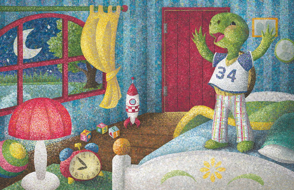
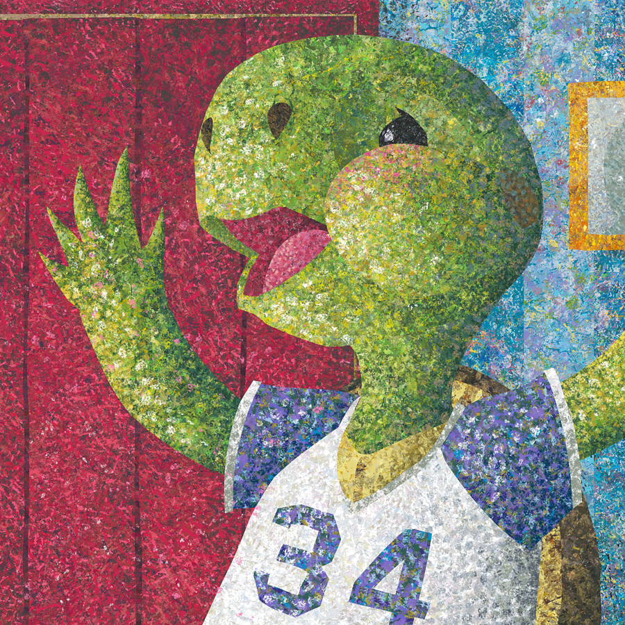
Back to children's illustrations this week and I've finally completed the first spread for the book I'm working on with author Richie Frieman, Before You Say Goodnight.
It was a challenging illustration to create as there are many levels of depth, many details and objects to put together without letting their textures mix with one another, choosing what colour everything is so it all come together beautifully and what the light source and brightness level of the room should be, given it's a very young children's book, so I didn't want to introduce heavy black shadows, but at the same time I wanted to make it feel like it's night time and have the lights and shadows be a bit dramatic.


I tried different versions out, and after showing Richie some samples too and getting feedback, this is the final result.


The text will fall on top of the white headboard of the bed.


I like working on a HUGE scale, it guarantees good quality for the illustrations and you can also print your work in large dimensions keeping the quality of the image if you so wish. The back draw is the computer's slow performance once the image has started becoming very complicated and heavy.

Thursday, 8 September 2011

revelation/structure


revelation


structure


Revelation and structure are two pieces of a sequence of events.

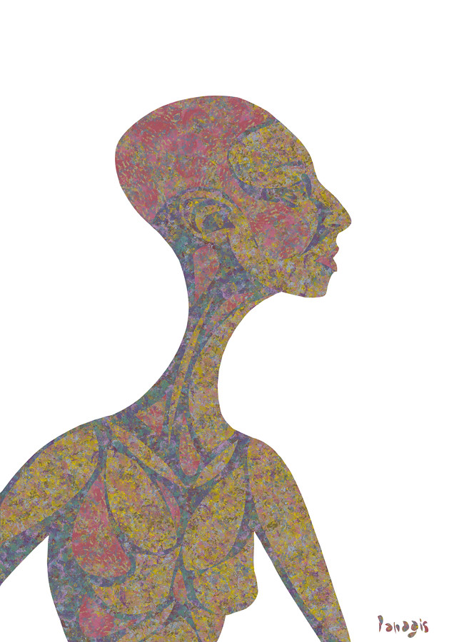
The book of revelation foretells the end of time and the annihilation of the human kind. Before the apocalypse consumes us all though there are moments in our life when the penny drops and ugly truths come into the light, sending us to a very dark place.
After a period of grief the desire to carry on living and to feel happy and healthy again kicks in and you start reconstructing yourself. A strong sturdy structure to sustain your new life.
Tuesday, 6 September 2011

Composure

Composure is hard to maintain in some cases.
When emotions of loss and grief conflict with the socially acceptable you have no choice but to stiffen up and bear, while pieces of you come undone.


Hello!

I'm back to blogging after a little summer holiday brake.
Because I don't post as often as I would like to on my blog, I've decided to expand its character and content.
I will make it a platform to showcase my broader artistic output and not only my artwork for children's books.
This will make my blog page  more interesting, richer in content and the updates a lot more frequent!

I hope you enjoy my new and improved blog!

Cheers!

Panagis 


Porovitsa Beach, Greece - Summer 2011

Saturday, 9 July 2011

New YouTube Channel!

Hello fellow bloggers!

As a creative person I much enjoy capturing emotions and making images through which I may express and share them with others and beautiful arty thing like that... But in the real world just producing artwork is not enough (if you want to make a living out of it, or pretend you are), no no no, you need to switch your brain to a marketing mode and try and promote that art work as much as possible.
It's interesting trying to find a balance between exposing your artwork to as many people as you can (and try and sell it really), while at the same time doing it in a tasteful way which won't kill your art.

I decided to use my old friend YouTube to expose my work to even more people. I found a way to present my still illustrations as a video and keep it interesting. I use music in these art videos and I think it works great!

But don't take my word for it, visit my channel and and have a look for yourself!
My YouTube Channel: PanagisMa
If you subscribe to my YouTube Channel you can follow all my upcoming art videos and animations too.

Make sure to watch my videos in full screen and in HD! (click on the video to get these options)


Take care!
Panagis

Saturday, 4 June 2011

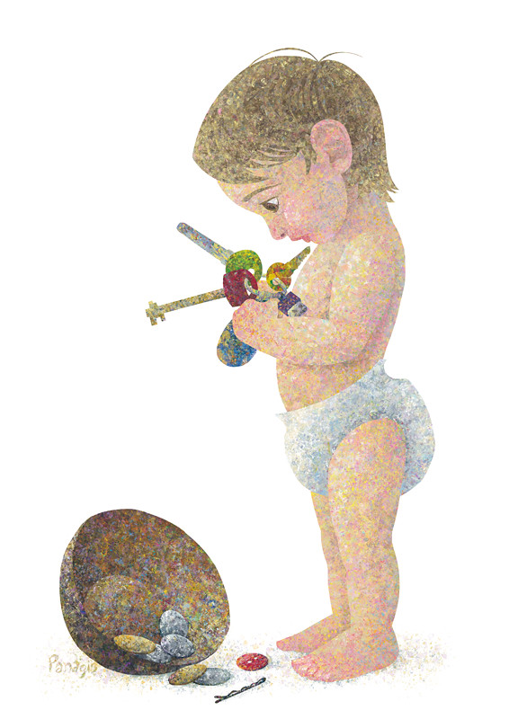
Has anyone seen my keys?


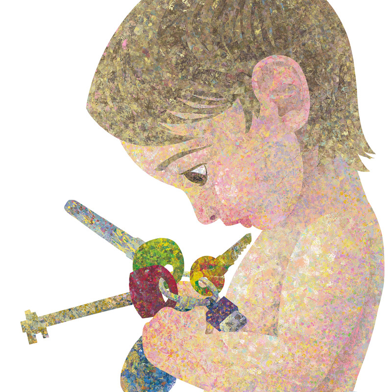
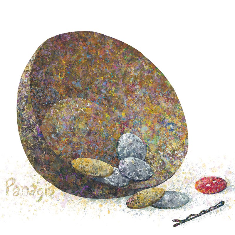
Inspired by how cute my two nieces look when they are discovering the world while leaving utter chaos behind them, I decided to capture the moment of study of the random new object in the above illustration :)

details


Friday, 15 April 2011

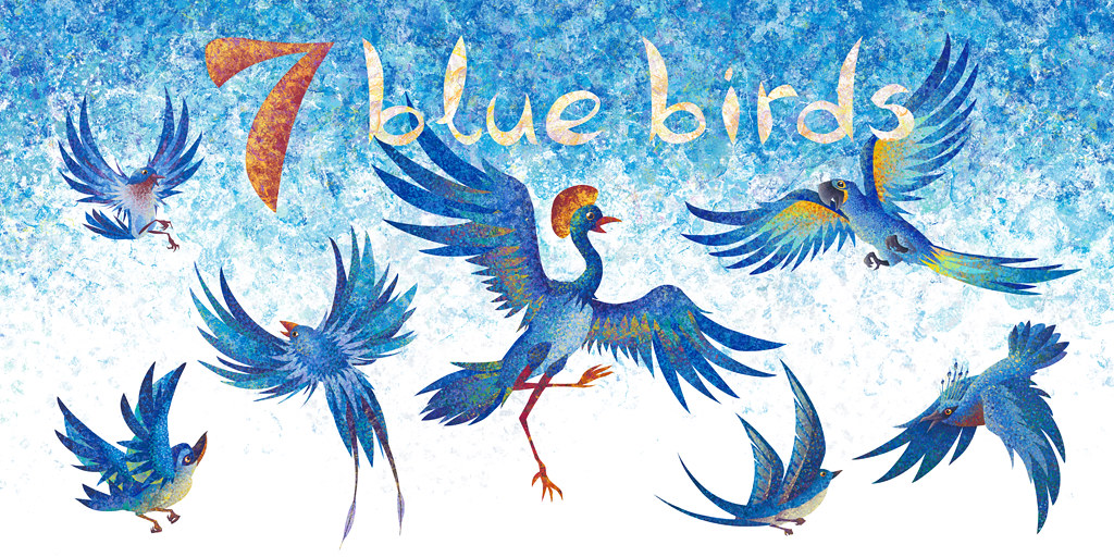
7 blue birds


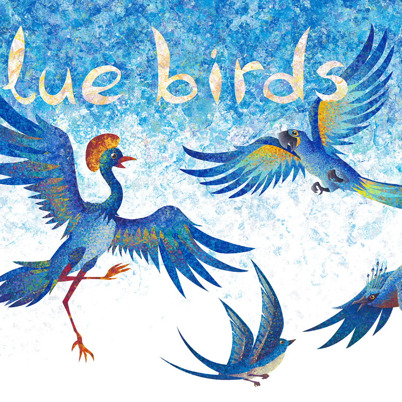
About a week ago I finished the spread for the colour blue. Blue birds, a symbol of hope from the ancient times!
When I visited the London Book Fair 2011 just a couple of days ago and showed my portfolio around, this was one of the pieces that stood out. It's one of my favourite too.

detail

Wednesday, 6 April 2011

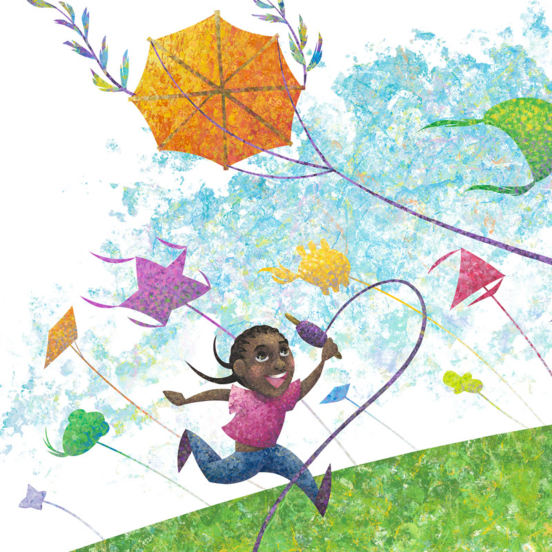
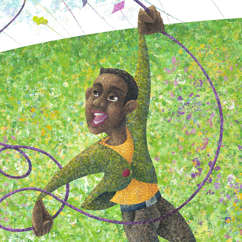
Katie and the Kite


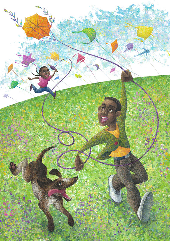
With all the sun these days what better than to take out the ol' kite?
I decided to revisit Katie and the Kite, since I'll be printing a portfolio soon. I didn't change anything drastically, but with a fresh eye I saw some things which I wanted to improve. I generally desaturated some parts and brightened up some colours too. I find it "breathes" a lot better now. The illustrations always come out considerably darker when you print them too, so that was also a concern.

details


Sunday, 3 April 2011

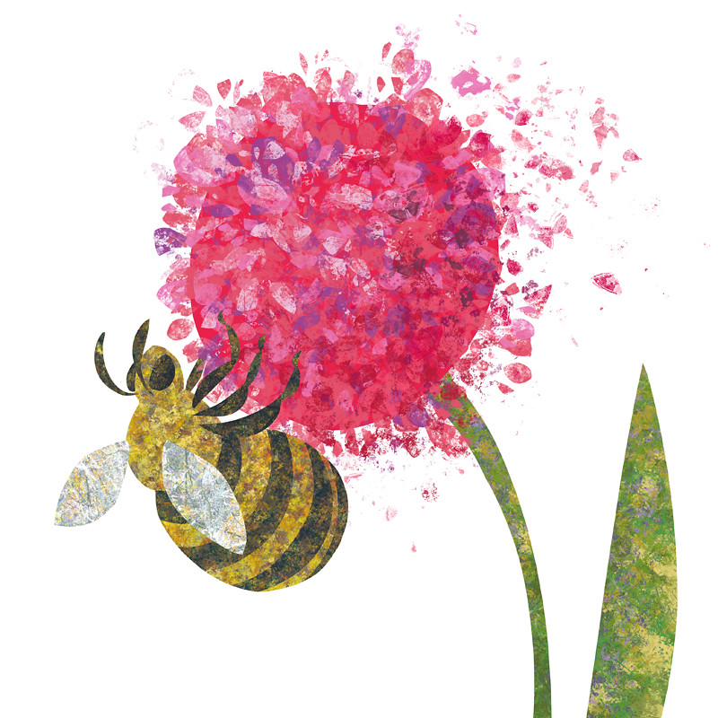
the fat bee


So I'm working on a storyboard for the "Just an Old Boot?!" tale, which is going great by the way, thanks for asking, but I felt like having a little brake from it, so I started playing with my digi-brushes and I came out with this little piece, the fat bee!

that was one long sentence!

Friday, 1 April 2011

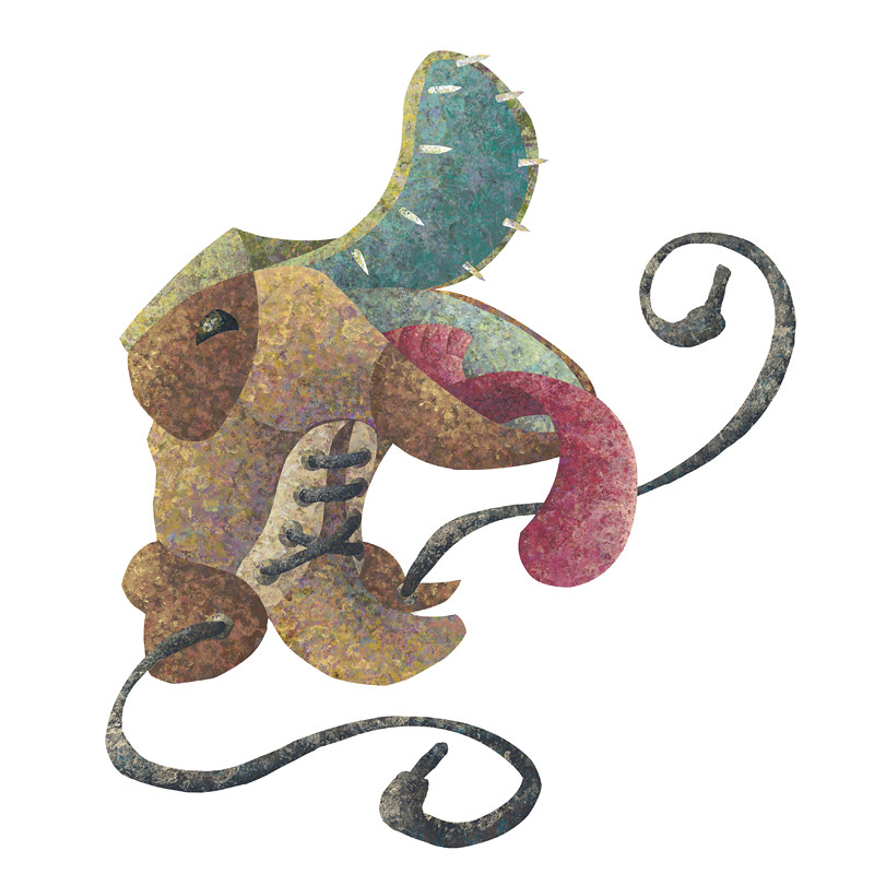
Just an Old Boot?!


So this is the first image for a story I'll start working on.
It should be a fun, short adventure of a boot who thinks it's an animal!
In vain the animals around the lake, where the boot has been dumped, try to convince it otherwise.
Maybe a boot is an animal...?

I'll keep you posted!

Thursday, 31 March 2011

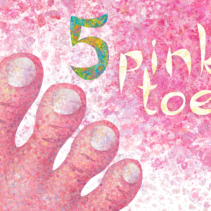
5 pink toes


I was stuck with what to use for the colour pink, which fell on the number 5, until a friend suggested I use 5 pink toes! Brilliant idea. I wanted to make the toes look like little balloons, round and silly looking, to make it fun.

detail:

Thursday, 24 March 2011

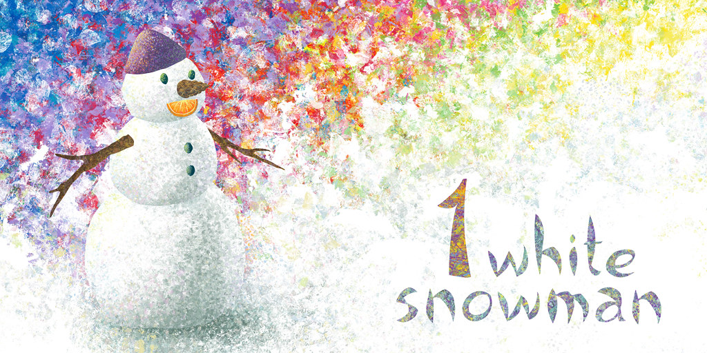
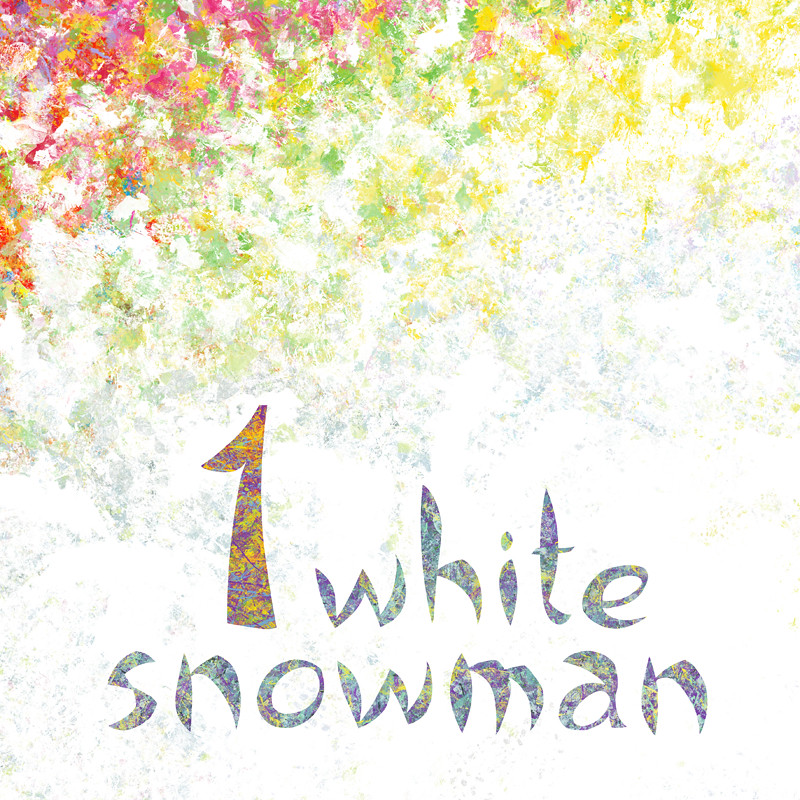
1 white snowman


So here is the third spread I complete for my Book of Colours and it's for white.
Technically white is not a colour, but no need to be pedantic with the little ones!
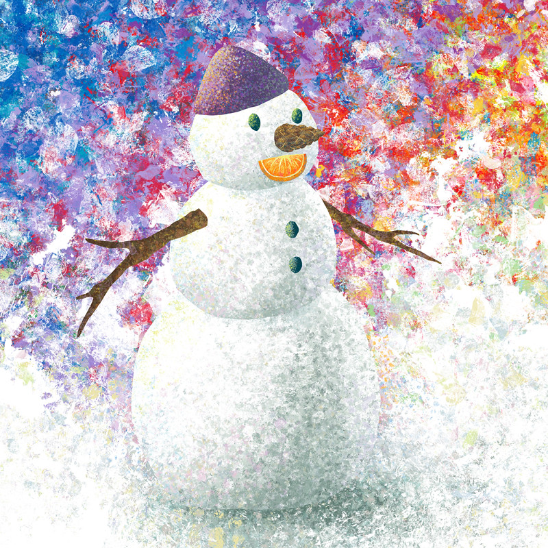
Since white is what you get when you mix all the colours, I decided to hint to this by creating a background with all the colours together. Also, I really like how the font has turned out and the colour-texture on the text.
These are two pages of a spread, the illustration folds in the middle, that's why there is a gap between the snowman and the text.

details: