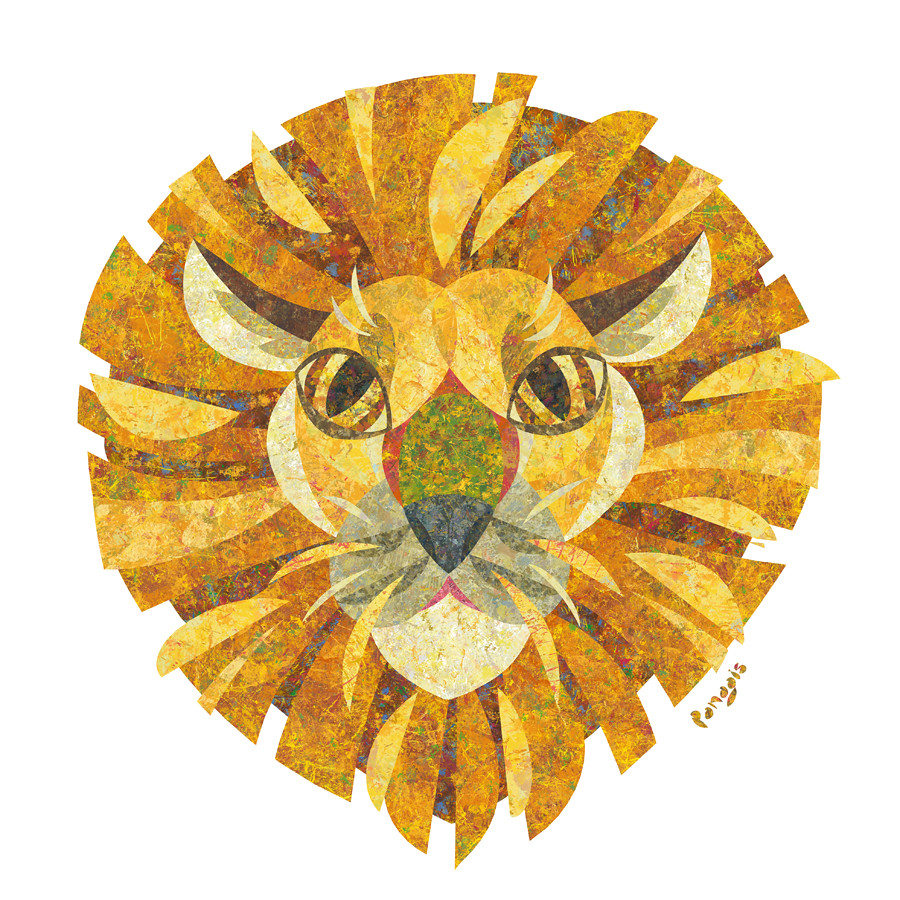
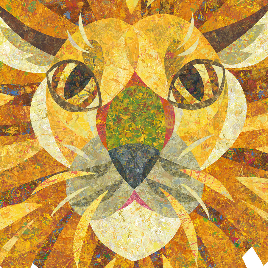
Τhe lion's head, made for the cover of my Wild Animals project, was the very first illustration in the series. However, after having completed it and printing it out I came to realise that the mane, was too messy with colours and shapes and distracted from the main shape of the lions head, which I felt was a shame. Now with a fresh eye I revisited this illustration and created this alternative look, which combines the exciting shapes of the original mane with a cleaner, easier to distinguish look.
I sometimes come back to an illustration and try and improve it if i feel I can do something better with it. Having finished this illustration I will move on to the next wild animal. I'll be posting sketches soon!


Your work is so beautiful!
ReplyDeleteCould you put up a email subscription option, so I can follow your blog more easily. I don't use blogger and so I don't get updates, even if I follow.
Thank you for your interest and for the heads up! A "Follow by E-mail" option has now been added to my blog. I shall be following your blog too, amazing work!
ReplyDelete