Thursday, 31 March 2011
Thursday, 24 March 2011
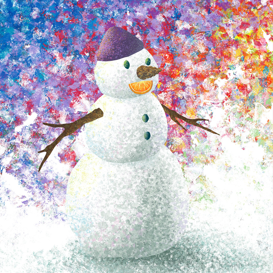
1 white snowman
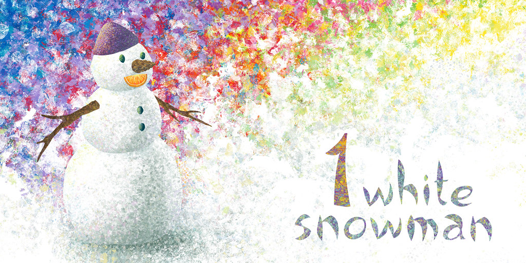
So here is the third spread I complete for my Book of Colours and it's for white.
Technically white is not a colour, but no need to be pedantic with the little ones!
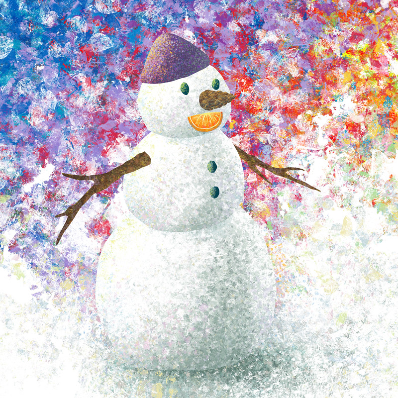
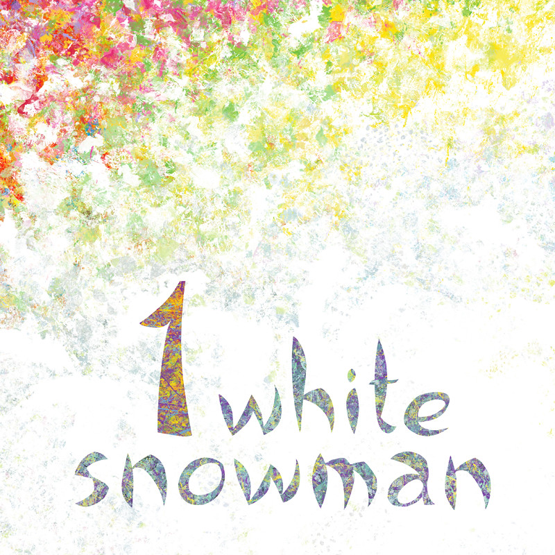
Since white is what you get when you mix all the colours, I decided to hint to this by creating a background with all the colours together. Also, I really like how the font has turned out and the colour-texture on the text.
These are two pages of a spread, the illustration folds in the middle, that's why there is a gap between the snowman and the text.
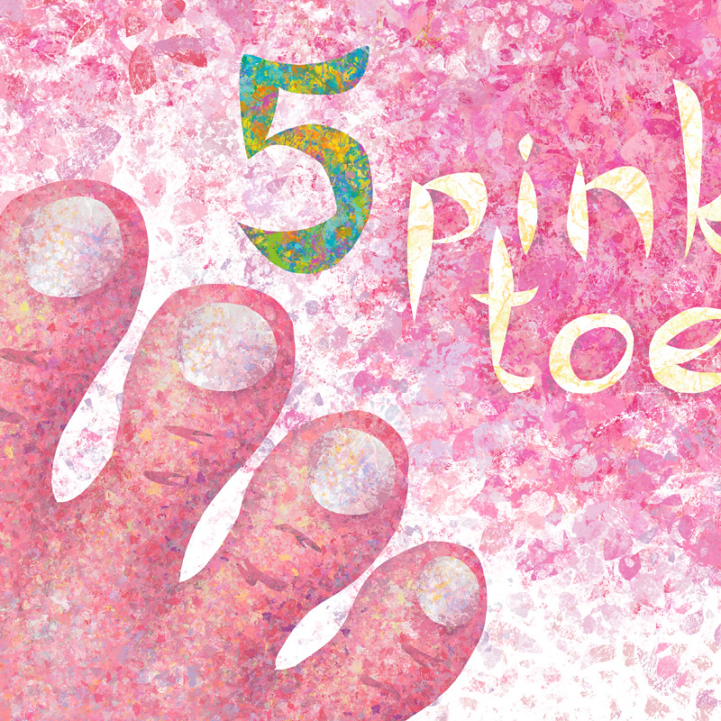
details:
Tuesday, 22 March 2011
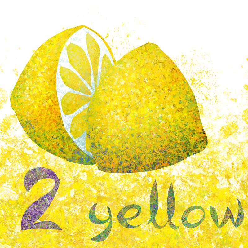
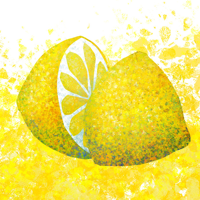
2 yellow lemons

The second illustration I complete for the Book of Colours and it's for the colour yellow. These lemons were the very first thing I illustrated in this style, I still love their vividness and mixture of colour. I use the sliced one for my promotional material often (as you can see on the heading of this Blog).
detail:
Sunday, 20 March 2011
Christmas Cactus
My Christmas cactus has flowers once more, great news! Must be the amazing weather :)

Saturday, 19 March 2011
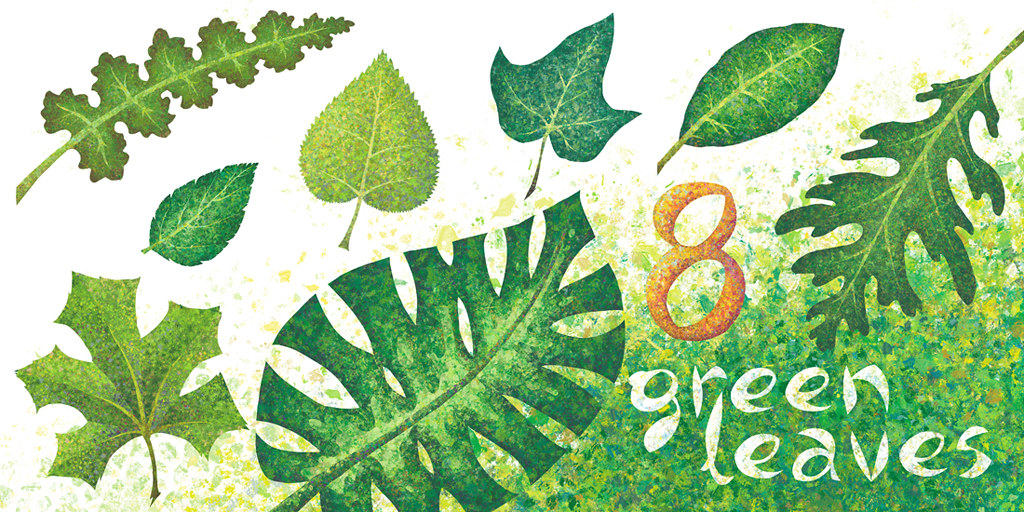
8 green leaves
From the book of colours, I have finished working on the first spread for the colour green.
This is great news as I've decided on the font I'll be using (free style organic) and have a layout style I'll be following for the rest of the spreads. The first one is the hardest!
More colours to come soon!
detail:
Thursday, 17 March 2011
♣ Happy St. Patrick's Day! ♣
According to legend, Saint Patrick used the shamrock ♣, a three-leaved plant, to explain the Holy Trinity to the pre-Christian Irish people. It's not to be confused with the four-leaf clover.
thanks Wikipedia!"Lá Fhéile Pádraig Sona Duit!" means "Happy St. Patrick's Day!" in Irish
On a second note, I think I'm starting to like this "spare cut-outs" font I've been using.lately.
I want the letters to reflect the organic shapes in my illustrations. The randomness and asymmetry is in tune with the over style of my work.
Tuesday, 15 March 2011
Prints on Sale!
You can now buy prints of my work on RedBubble.com!
Here is the link to my work, I'll be uploading more illustrations soon.
www.redbubble.com/people/panagis
there is a wide range of sizes you can get each illustrations in, from postcard to framed artwork
Happy shopping! :)
Here is the link to my work, I'll be uploading more illustrations soon.
www.redbubble.com/people/panagis
there is a wide range of sizes you can get each illustrations in, from postcard to framed artwork
Happy shopping! :)
Saturday, 12 March 2011
Business Card & Promotional Postcard
So I'm trying a couple of online printing sites for my promotional material.
Most of them give you a great deal in order to register with them, so didn't have to splash out too much, with is great since I have no idea what the prints will come out looking like.
Probably over-saturated with horrible contrast making every dark colour black - positive thinker (and experienced printer...)
Here is my business card!
and here is the main postcard 4"x6"
Friday, 11 March 2011
Thursday, 10 March 2011
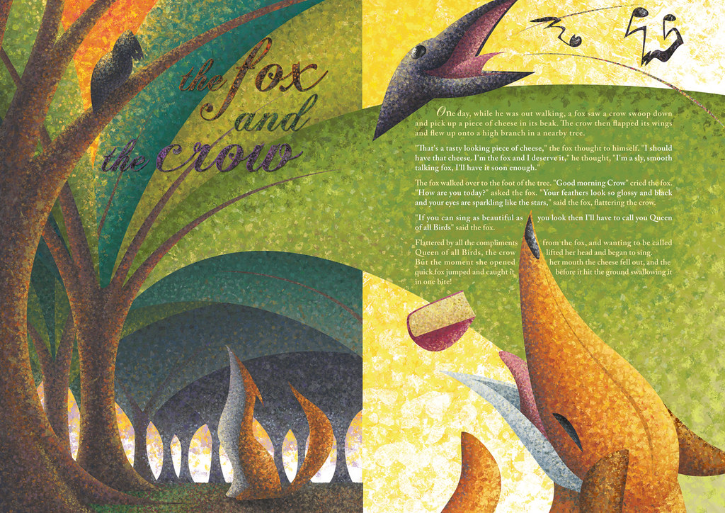
the Fox and the Crow
One of a fables I remember vividly from my childhood is that of the cunning Fox (a typical role for "her") and the vain but birdbrained Crow.
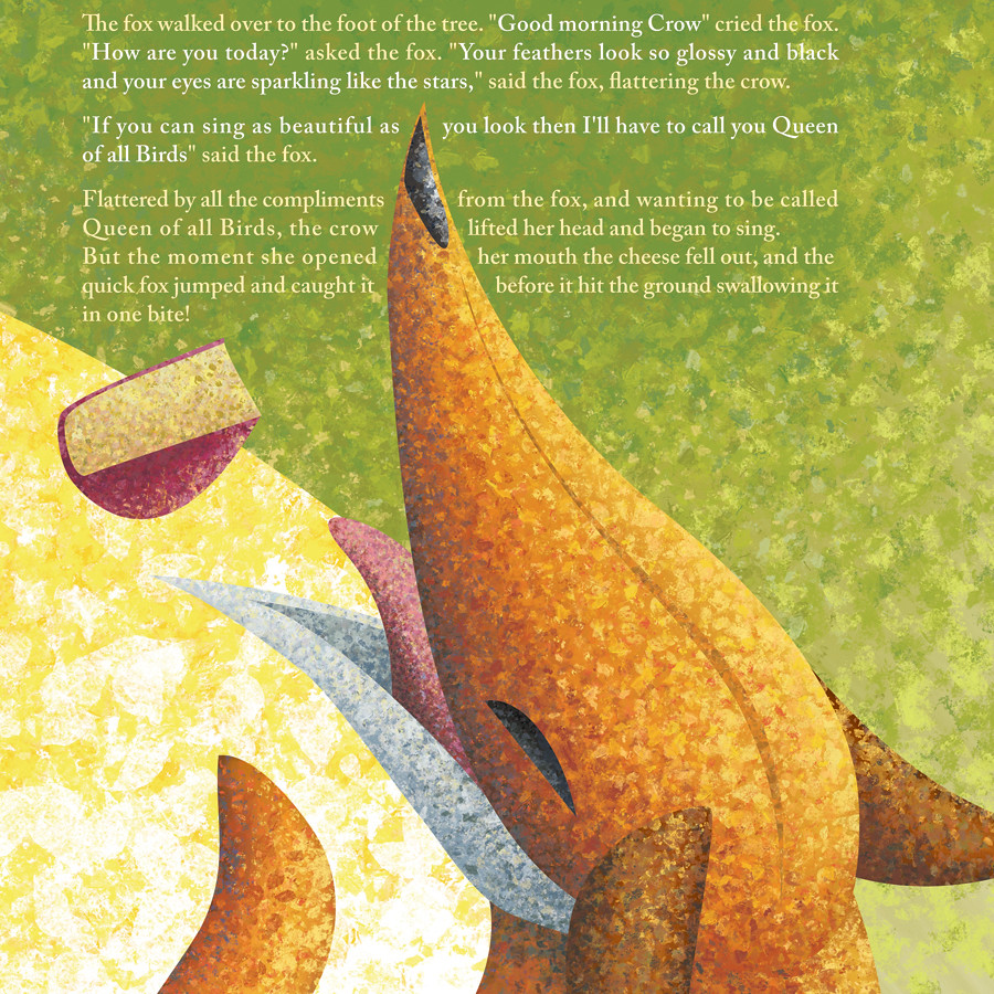
I wanted to create an interesting layout combining text and the different visual elements. In this two page version of the tale I wanted to show the two characters standing on different levels from each other and also close-ups of them at their most characteristic moment from the story.
The moral of the tale is not to attempt to sing while you're eating cheese, it might fall out of your mouth!
details


Wednesday, 9 March 2011
Tuesday, 8 March 2011
Subscribe to:
Comments (Atom)


